Introduction to Data Visualization
Announcements
Updated feedback template
- You’ll get an individual version (shared with you + me)
- Any immediate questions?
Intro to Tidy Tuesday
Tidy Tuesday 1 due Monday at 11:59pm
Scored 0, 1, 2, or 3
Can submit as many as you’d like out of 14
Your top 3 grades will go into your Final Grade calculation
At least one submission in first five Tidy Tuesdays (i.e. at least one by Feb 24)
- One will turn into your Iterative Viz
Learning Goals
- Understand the Grammar of Graphics
- Use
ggplot2to create basic layers of graphics - Understand the different basic univariate visualizations for categorical and quantitative variables
Benefits of Visualizations
Visualizations help us understand what we’re working with:
- What are the scales of our variables?
- Are there any outliers, i.e. unusual cases?
- What are the patterns among our variables? Center? Spread? Distribution?
This understanding will inform our next steps:
- What method of analysis / model is appropriate?
Once our analysis is complete, visualizations are a powerful way to communicate our findings and tell a story.
Glyphs
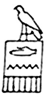
In its original sense, in archaeology, a glyph is a carved symbol.
| Heiroglyph | Mayan glyph |
|---|---|
 |
 |
Data Glyph
A data glyph is also a mark, e.g.


The features of a data glyph encodes the value of variables.
- Some are very simple, e.g. a dot:
![]()
- Some combine different elements, e.g. a pointrange:
![]()
- Some are complicated, e.g. a dotplot:
![]()
Components of Graphics
frame: The position scale describing how data are mapped to x and y
glyph: The basic graphical unit that represents one case (also know as a mark and symbol).
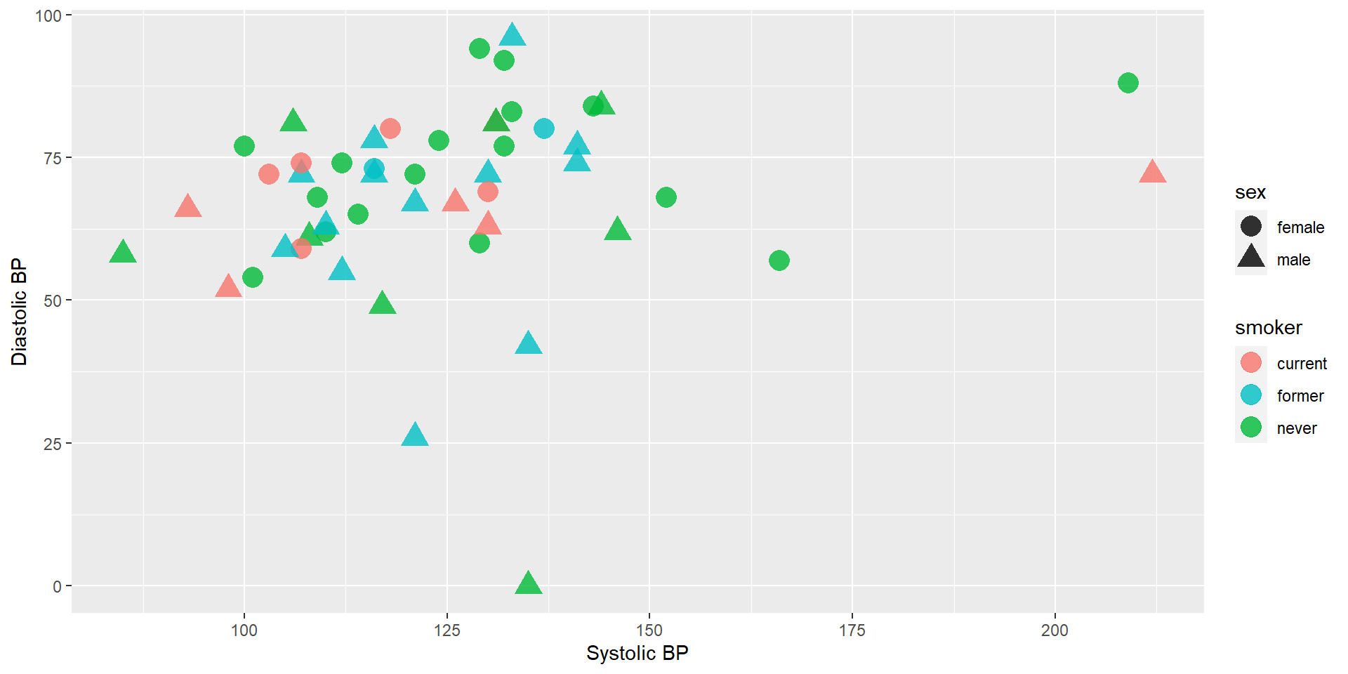
Components of Graphics
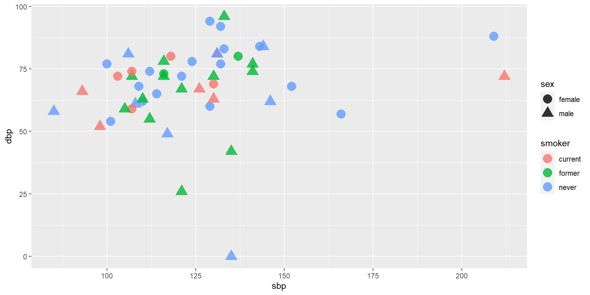
aesthetic: a visual property of a glyph such as position, size, shape, color, etc.
- may be mapped based on data values:
smoker -> color - may be set to particular non-data related values:
color is black
- may be mapped based on data values:
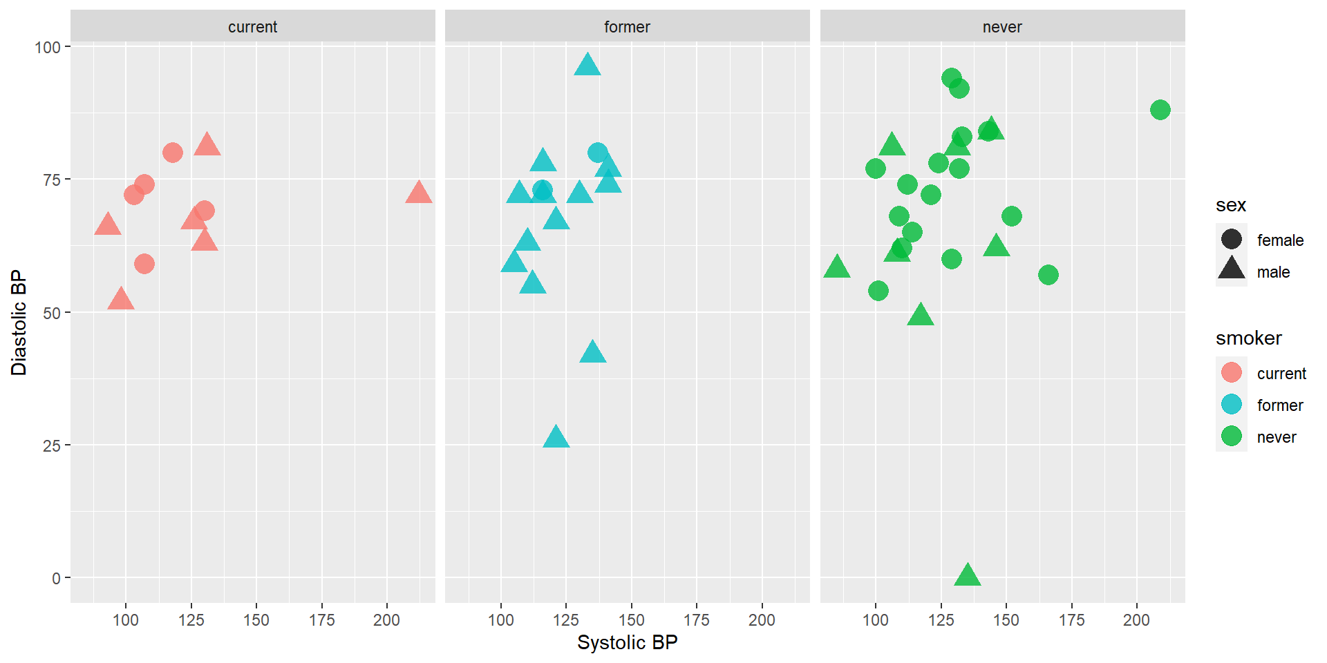
facet: a subplot that shows one subset of the data
- rather than represent
sexby shape, we could split into two subplots
- rather than represent

Components of Graphics
scale: A mapping that translates data values into aesthetics.
- example: never-> pink; former-> aqua; current-> green
guide: An indication for the human viewer of the scale. This allows the viewer to translate aesthetics back into data values.

Eye Training for the Layered Grammar of Graphics
Each group will be assigned one NY Times graphics to look; list at the course website.
If you haven’t already, follow the instructions to gain access (paid by Macalester MCGS) to content at NYTimes.com.
Exercise: Basic questions to ask of a data graphic
For your assigned graphic, discuss the following seven questions with your partner(s):
- What variables constitute the frame?
- What glyphs are used?
- What are the aesthetics for those glyphs?
- Which variable is mapped to each aesthetic?
- Which variable, if any, is used for faceting?
- Which scales are displayed with a guide?
- What raw data would be required for this plot, and what form should it be in?
Glyph-Ready Data
Glyph-ready data has this form:
- There is one row for each glyph to be drawn.
- The variables in that row are mapped to aesthetics of the glyph (including position).
Data Visualization Workflow + ggplot
Layers – Building up Complex Plots
Using the ggplot2 package, we can create graphics by building up layers, each of which may have its own data, glyphs, aesthetic mapping, etc.
Base Layer
The first layer just identifies the data set. It sets up a blank canvas, but does not actually plot anything:
Geometry Layer
Next, we add a geometry layer to identify the mapping of data to aesthetics for each of the glyphs:
Guide Layer
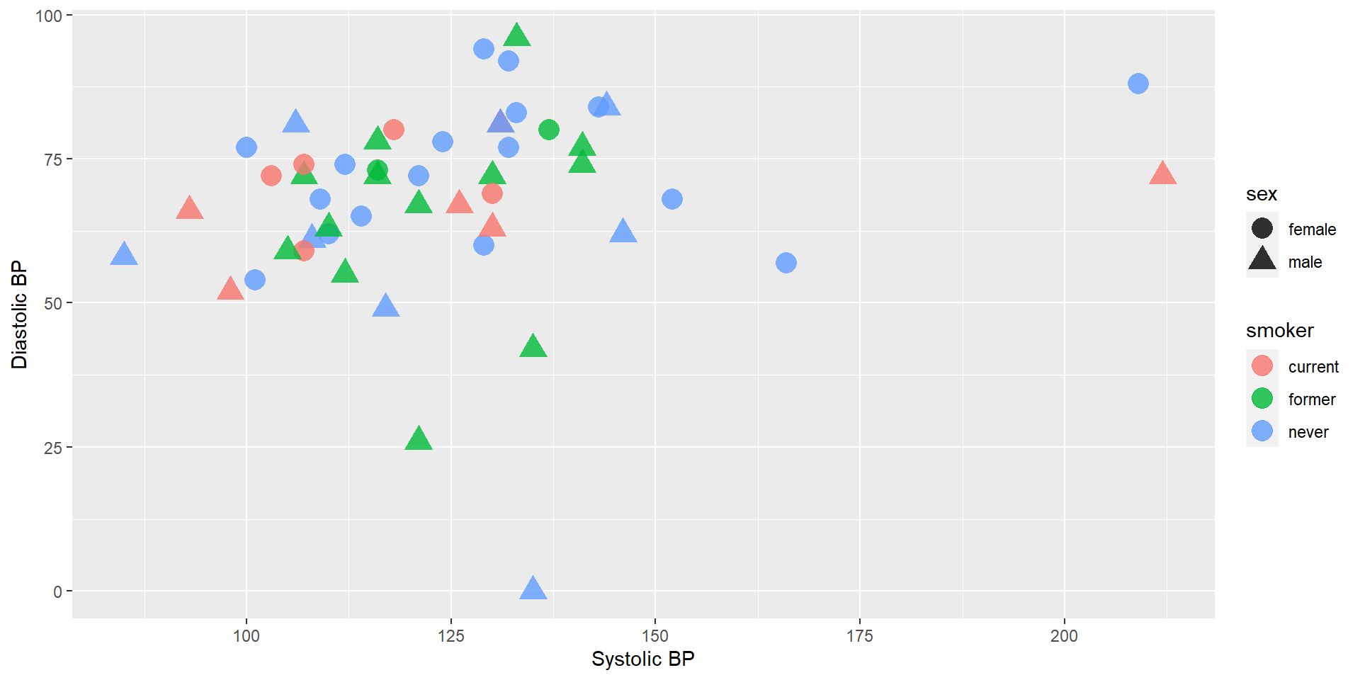
Next, we can add some axes labels as guides:
Scale Layer
We can change the scale of the color used for smoker status:
Facet Layer
If instead we wanted to facet into columns based on smoker status, we could add another layer for that:
Getting Started
There’s no end to the number and type of visualizations you could make.
- Ask the data questions.
- Start with the basics and work incrementally.
- Focus. Pick out a focused yet comprehensive set of visualizations.
Rest of Class
Continue on with the activity working through in the template Rmd.
Get immediate feedback with the Solutions online.
After Class
Continue to work through the activity in the Rmd file.
You’ll submit a knitted html file of that template Rmd file for Assignment 2 (due Wednesday, Feb 1 at 11:59pm).
- We’ll give feedback on Exercises 2.12-2.15.
Tidy Tuesday 1 due Monday at 11:59pm
Scored 0, 1, 2, or 3
Can submit as many as you’d like out of 14
Your top 3 grades will go into your Final Grade calculation
At least one submission in first five Tidy Tuesdays (i.e. at least one by Feb 24)
- One will turn into your Iterative Viz


